
Schmoop
Brand system and release framework for a touring electronic music artist
Creative Direction, Brand Strategy, Animation
ROLE
YEAR
2025
Illustrator, Photoshop, Blender, Notch, HTML, CSS
TOOLS
Brand Identity Kit, Motion System, Website, Social Media Marketing, Merchandise, Release Framework
DELIVERABLES
OVERVIEW
Brand System for a touring electronic artist focused on sound design and immersive performance.
Built to support releases, promotion, and live visuals without redefining the identity per campaign.

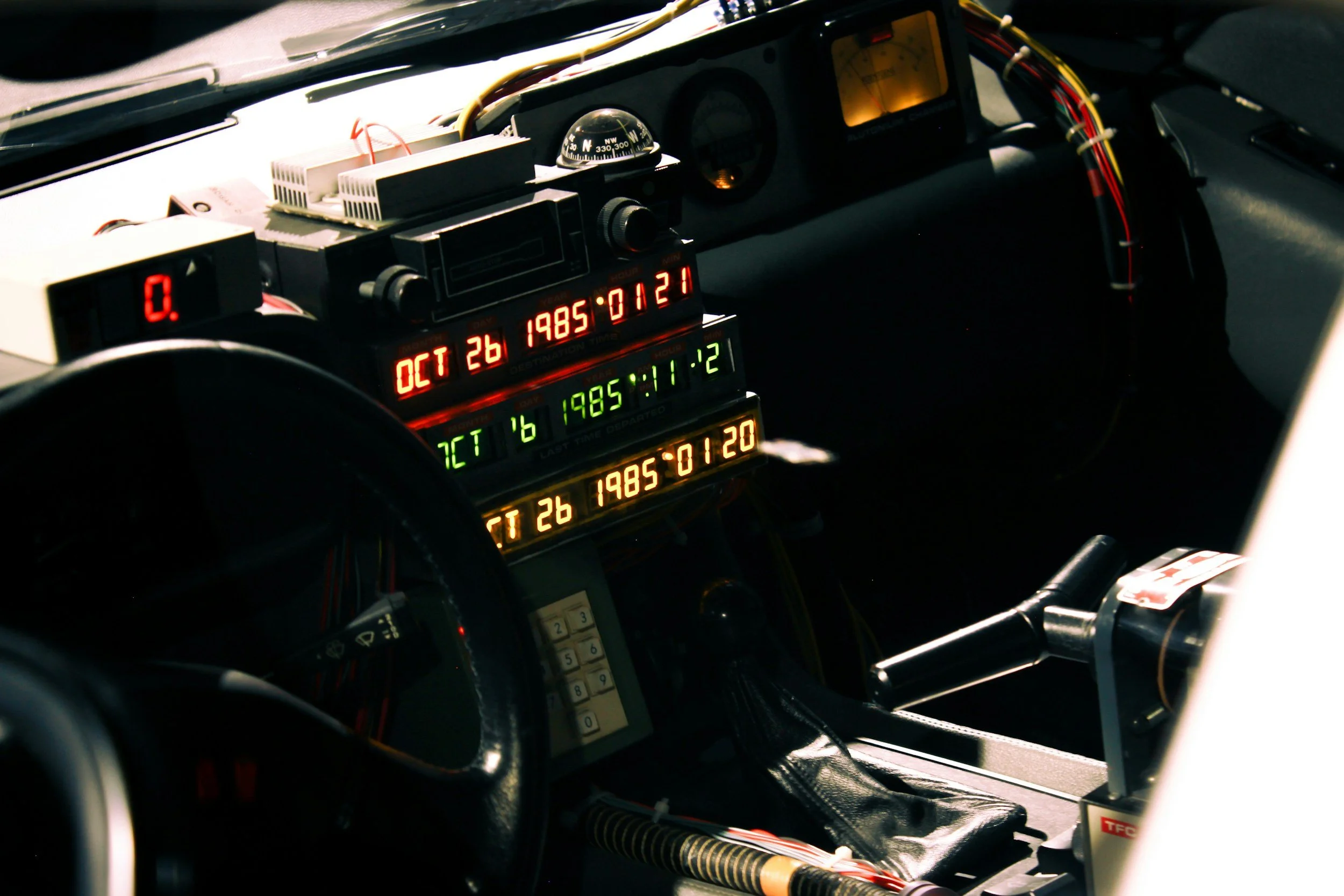
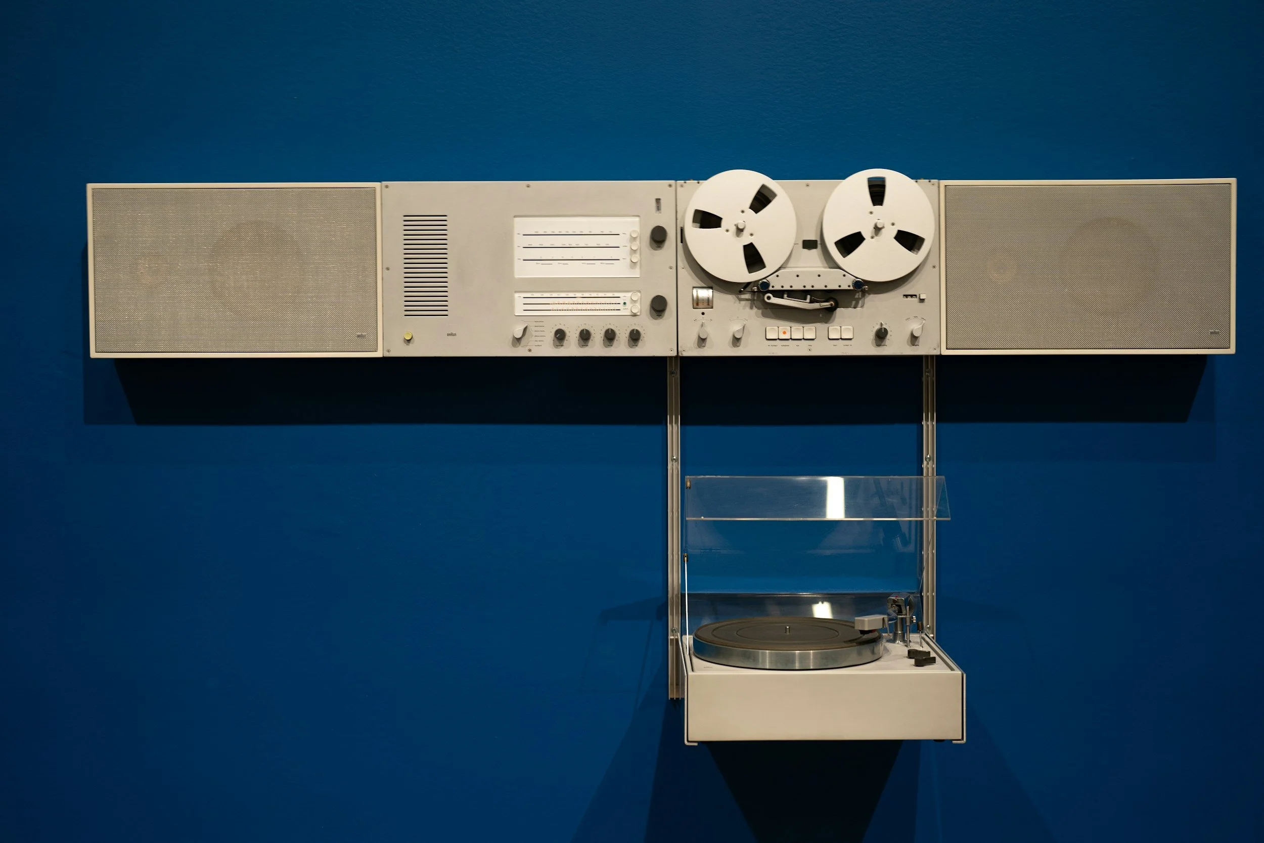
CONCEPTS + INSPIRATIONS
The visual direction blends futurism with retro technological references, drawing from digital displays, analog interfaces, and cassette-era design language.
Brand System
A modular identity system designed to operate across digital, physical, and live outputs
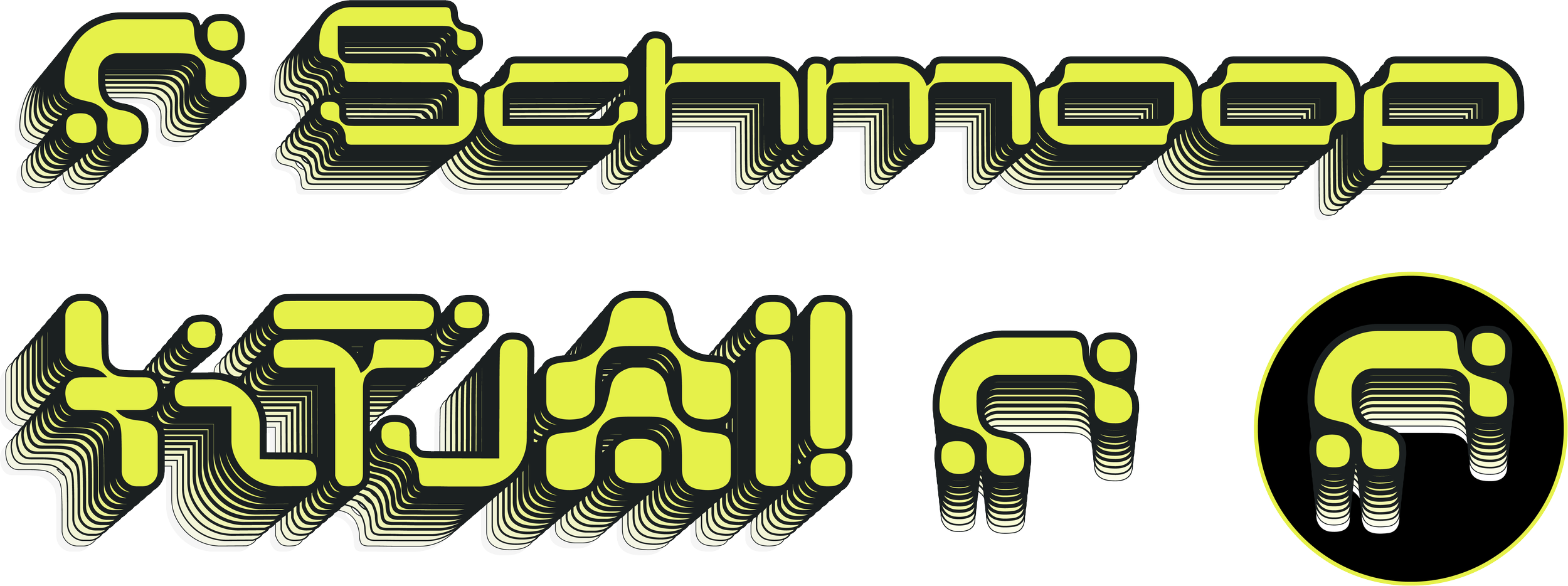
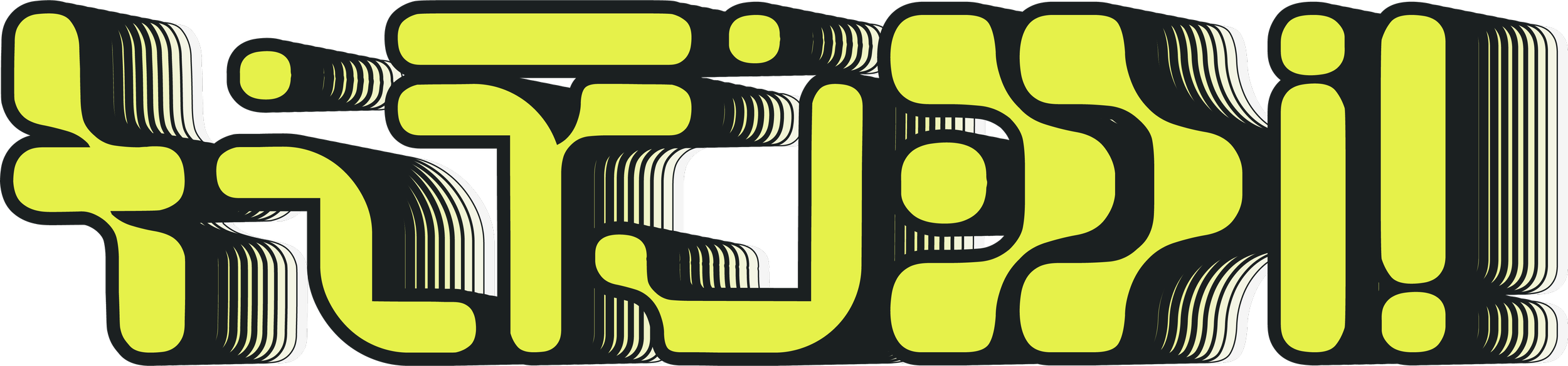
Lettermark, symbol, and lockup system for flexible use across formats
Identity

SYMBOL

LETTERHEAD
LOCKUP
Typography
Typography system defining hierarchy for artwork, promotion, and motion
PRIMARY
SECONDARY
ACCENT
Color Palette
Color palette balancing neutral structure with accent variation

Graphic language derived from technological interfaces and display systems
Graphic Styles


SYSTEMS
These systems balance clarity and playfulness, allowing for variation while maintaining identity. This allows for assets to be built for digital and live environments quickly, without redefining direction.
Each release kit moving forward adapts within the system while maintaining continuity across outputs.
Release Framework
Structured framework for releases and ongoing campaigns
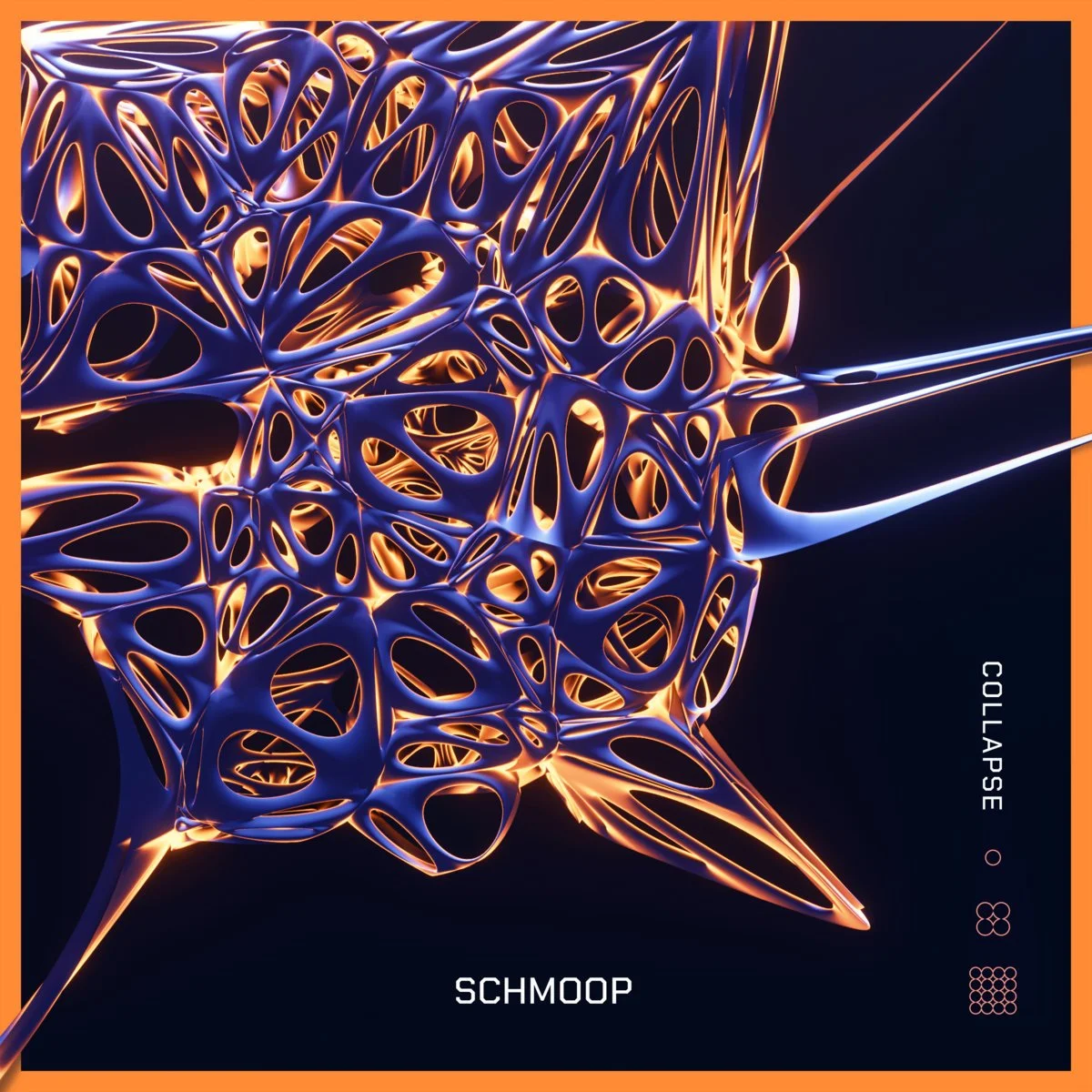
EP artwork system with consistent layout logic, components, collateral, and rollout
RELEASE STRUCTURE

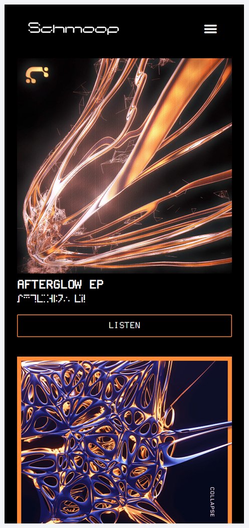
Afterglow EP
af•ter•glow /ˈaftərˌɡlō/
A glow remaining where a light has disappeared.
A pleasant effect or feeling that lingers.
Three years following Schmoop’s EP Collapse, Afterglow dives further into his familiar Glitch Hop sound, combined with a foray into Drum & Bass and Jungle. The theme of “Afterglow” signifies the continued creative impact of past experiences, and a sense of hope and beauty in the face of change.
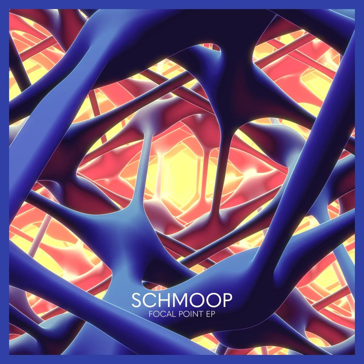
Previous release artwork used as a visual reference point and aesthetic benchmark.
Note: Past artworks were not created by me.
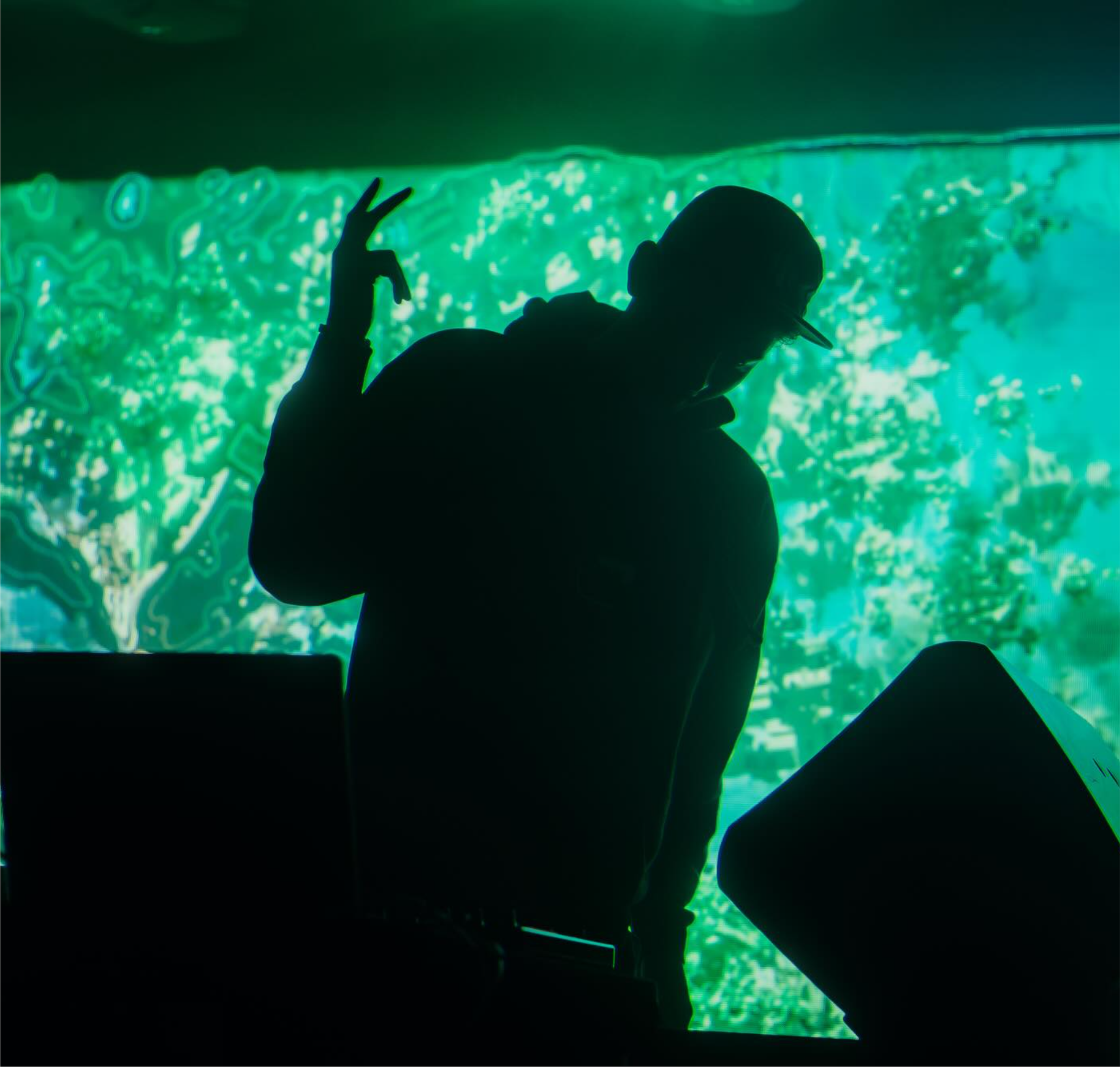
Motion system applied across music videos and promotional content.
ANIMATION
MUSIC VIDEO
Photoshop
Illustrator
RetroTINK 4K CE
Tachyons+ Vortex Decoder
SOFTWARE + TOOLS
Blender
Notch
Resolume Arena
Premiere
After Effects
TEASER PROMO
RELEASE PROMO
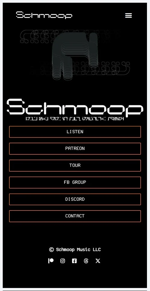
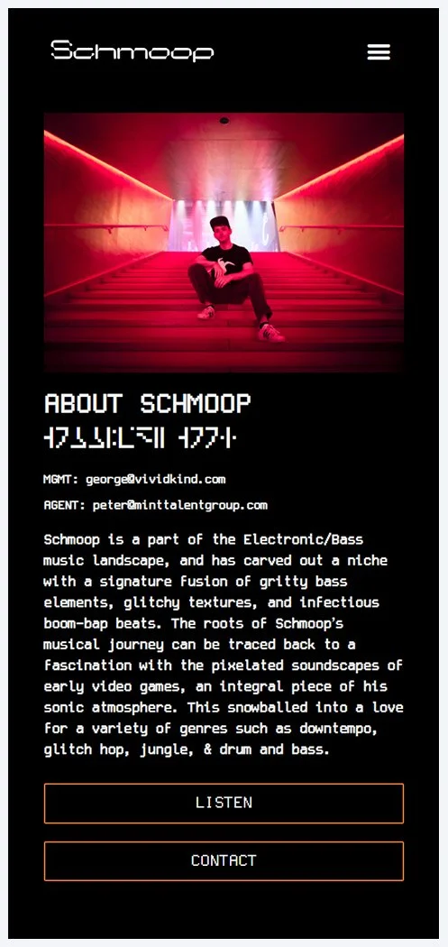
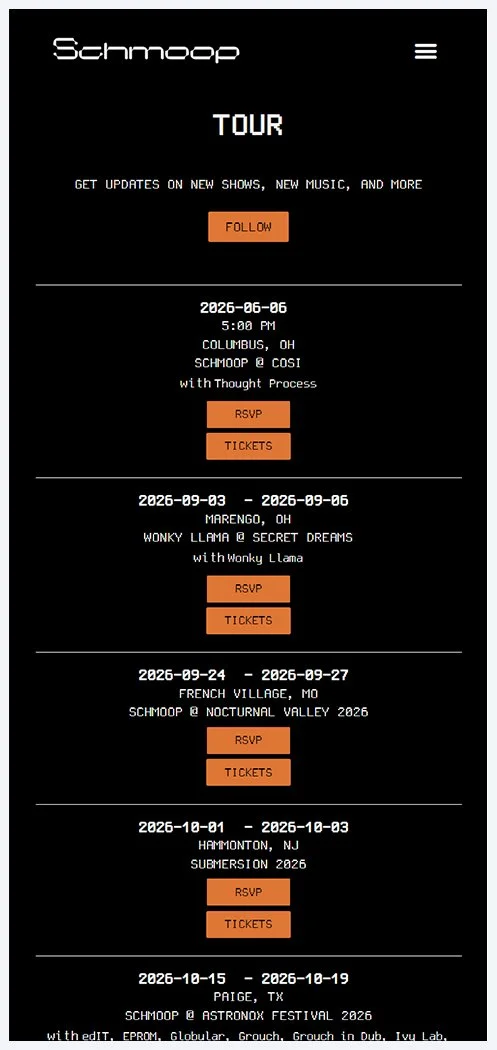
Web Platform
A responsive web platform designed to adapt and display brand information
A structured extension of the identity system designed to support promotion, booking, and communication
The visual system is applied directly to a modular web platform, using the same typography, color, and layout logic to maintain continuity across digital outputs.
Content is organized to support releases, tour communication, and audience interaction without requiring structural redesign.
DIGITAL PLATFORM
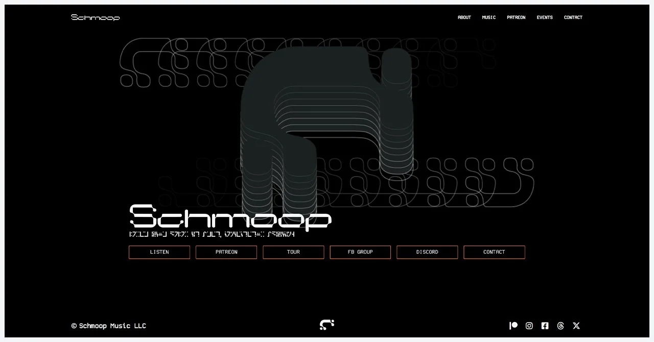
HOME
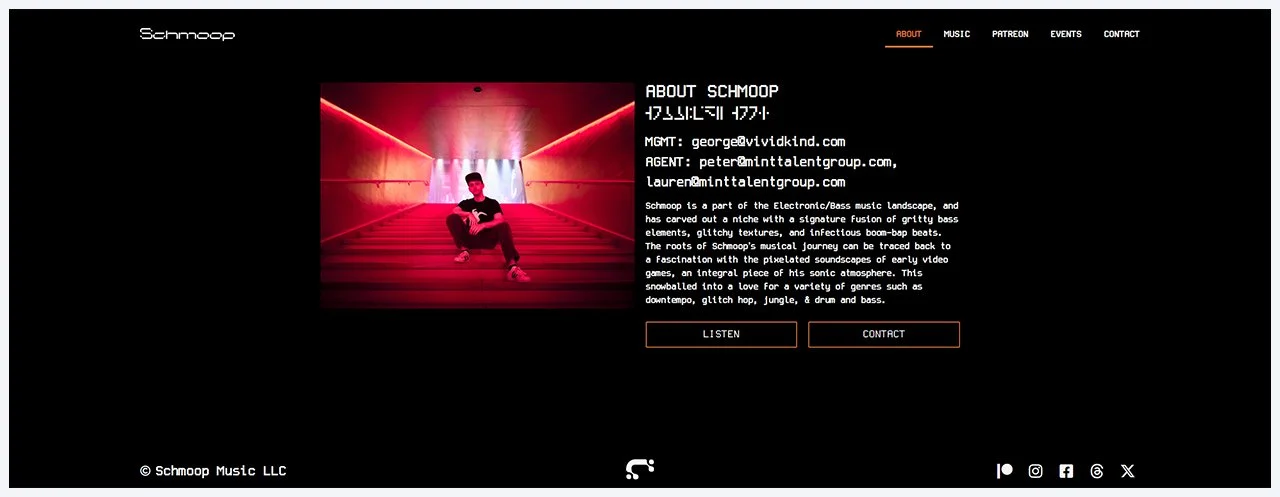
ABOUT
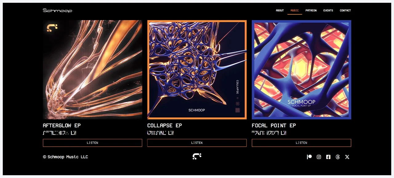
MUSIC
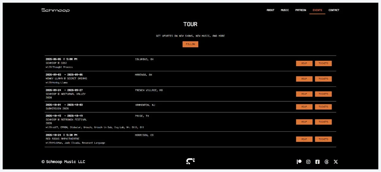
EVENTS
OUTCOME
Established a cohesive visual identity system that improved brand recognition across releases, social platforms, and live performances.
Enabled consistent application of the identity across releases and live outputs, resulting in clearer brand recognition and more cohesive presentation over time.
“The clarity and confidence that came out of these projects completely changed how I operate. Everything now has clearly defined boundaries, but within that, I feel free to explore the full creative spectrum. The work gave me a much better understanding of where ideas can go, and how far to push them.”
William Russek // Schmoop